

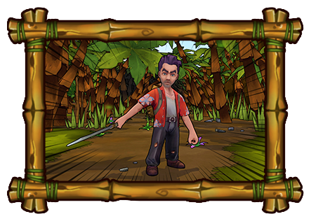
Since we started showing the game there has been a lot of interest and positive comments about Lost Sea's art style. To be honest we weren't really expecting it to appeal to as many people as it did! We've had everyone from hardcore survival game fans to parents with young kids coming over to check out the game!
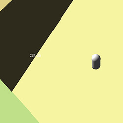
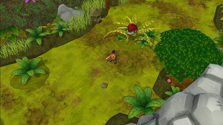
We also received a few, more in-depth questions from other developers and press about the game art direction so I figured I'd put together a blog post about it. I don't think many people get to see just how much a game evolves over time so I have attached a few images showing how the game first looked, up until now.
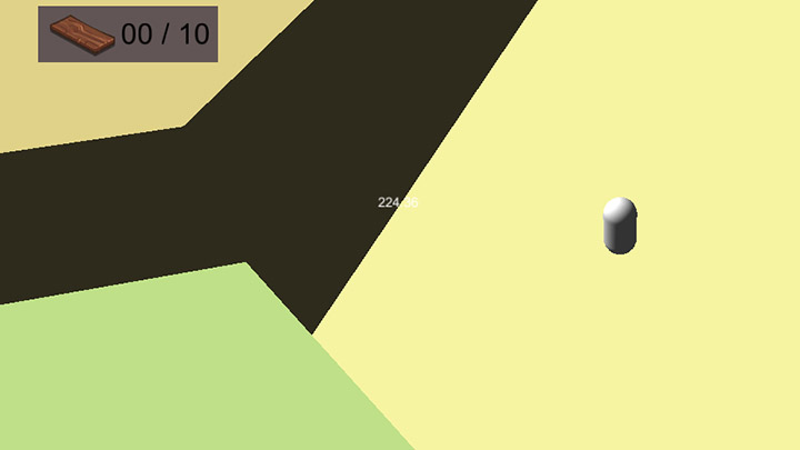
Finding the Tone
One of the decisions that we made really early on was that we wanted to make a bright, colourful game. There were a couple of reasons for that but, primarily, it's just because these are the type of games we love to play. We all grew up playing games like Banjo Kazooie and Crash Bandicoot so straight away we knew that we wanted to make a game in that style.
But sometimes, really, really liking something isn't a good enough reason to go for it. Luckily for us there were a number of other reasons why this style was a good fit for us!
The game is set in a tropical paradise. Look at any picture of a tropical island and you can see it's very bright and colourful. Even in the midst of a tropical storm there will still be brightly coloured plants, luminescent bugs and creatures with striking patterns. Since we knew our game was also going to include other worldly elements this art style gave us a lot more flexibility. I think one of the reasons so many sci-fi and fantasy adventure stories take place in the jungle is because it already feels like a strange environment. Just type weird jungle creature into google - 90% of the stuff on there wouldn't look out of place on an alien planet!
Aside from creative flexibility, trying to make something fantastical look realistic is a very time consuming process. Everything comes under much greater scrutiny when it is higher fidelity and as a small team we didn't have that sort of man power. We decided that we would rather have more variety than detail.
Finally since one of our core game components involved fixing up a ship we knew it had to feel very mechanical and straight forward. If you wanted to fix a modern ship now you'd need fibreglass, some weird tools and all this other stuff you'd never find washed up on a beach. Setting the game in a simpler time when ships were still made out of wood made much more sense.
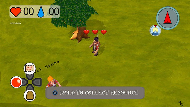
Defining the Style
Once we had found the style we wanted (which we loosely defined as "cartoony" and "chunky") we set about finding reference. Aside from games we looked into a bunch of other reference, and when you start looking for retro, tropical island reference, you very quickly run into Tiki culture. Tiki culture is really, really interesting - it's a time when everything was very serious and straight laced but there was this huge demand for escapist fantasy. It was also the time that Disneyland was opened to the public. Disneyland is always a great reference for game developers for a number of reasons, but in particular we looked into Adventureland and how it combined disparate elements of fantasy adventure into one cohesive zone.
Since we were digging around in 1950s pulp it wasn't long before we stumbled upon B-movies and their amazing poster art. This seemed like the ideal fit for our game. Stories of intrepid adventures in strange locations, weird other-worldly creatures all set in first half of the 20th century - it was perfect! We had found our art style that we called Cartoon B-movie.
Iteration, Iteration, Iteration
With the direction sorted, we gathered a bunch of relevant reference material and set about making a test scene. It was a case of constant iteration to get it to where it is now. There are a few things in particular I would like to call out.
The black stroke around the assets. This was something we tried to get early on but just couldn't get it looking good. We disabled it right up until a few months before PAX when we found an appropriate shader that we could use. This made a huge difference to the readability of the game as it made everything pop and stand out from the background. It's one of the reasons why, despite tons of stuff happening on screen at once, League of Legends is still very readable.
Simplifying the busy textures and grass. We tried to mimic the busy floor and wall textures of real life jungle environments but it was too visually busy. It is ok in games where the camera is closer to the floor (FPS for example) but with our camera angle it made it tricky to follow the action on screen.
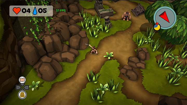
Mud paths. One of the big changes was to call out paths between rooms and landmarks. This gives the player an easy way get back on track if they ever feel lost. Worn down grass exposing dirt paths are a sure sign people have walked that way and people seem to get this (even if it is subconsciously).
The camera angle made it tricky to define negative space clearly. This was solved by adding very dark, high density vegetation around the walls of the levels so that the eye is focused inward to the action in the middle of the screen.
Challenges
When we first started making props and environments I joked that there is a good reason why a lot of games take place on space stations or industrial facilities. Making organic environments is really hard! There are a few reasons why:
- They're asymmetrical environments, but at the same time need to use a bunch of pre-made props.
- They're visually, very busy but need to be clear and readable.
- They're organic and chaotic but need to support unit path finding, and structures being built on them reliably and consistently.
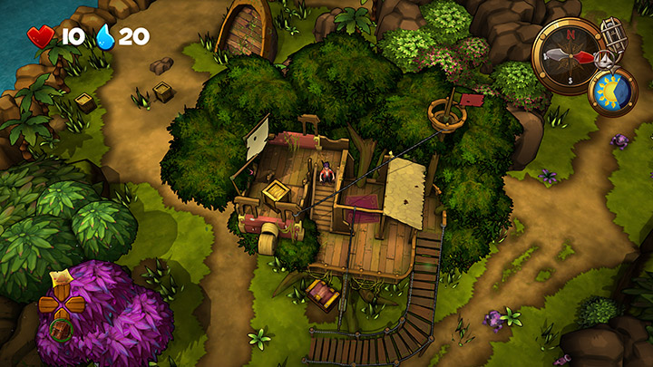
It was really challenging, but we just kept iterating until we had worked our way around them. What we have ended up with is a flexible system that allows us to generate a large amount of environments quite quickly. There is quite a lot to talk about how we handle procedural generation that I will talk about in another blog post in the future.



 " and "PlayStation" are registered trademarks of Sony Computer Entertainment Inc. "
 " is a trademark of the same company. "Xbox One" is a trademark of Microsoft group of companies and is used under license from Microsoft. Steam and the Steam logo are trademarks and/or registered trademarks of Valve Corporation in the U.S. and/or other countries. All other trademarks and registered trademarks are property of their respective owners.